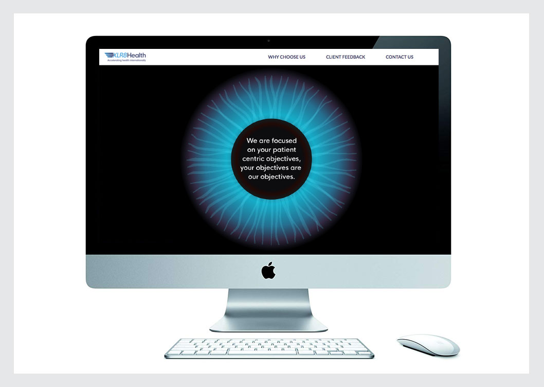
When XLR8 Health commissioned their website, we kicked off with an off-site team meeting. Each staff member approached our clients, and potential new clients (in the Pharmaceutical sector) to find out their website ‘bug-bears’. It was good to get out of the office and bring our collective client opinions about the site around the table. We also looked in-depth at our own direct competitors and discussed the good and bad points about these sites.
The overriding piece of feedback turned out to be that our target users notoriously had a lack of time – they didn’t have time to read waffle. Therefore we felt the site should be accessible from one page, with minimal navigation. The large ‘eye’ brings attention at the beginning and provides a great visual springboard before users scroll down the page. You can visit the site here.

